How to speak to a Sydney audience with animation

Ahh, Sydney. Home of Luna Park, AC/DC, that one revolving restaurant we all deny having dropped a few hundred bucks to eat at, and 42 Wallaby Way. Well, maybe not the last one.
With so many recognisable landmarks Sydney is not only the tourism capital of Australia, but also sits among the top-fifteen most visited cities in the world. But what if we want to discover the residents who choose to make their permanent home in the harbour city?
Trying to pin down the best way to present your brand a localised audience can be tricky amongst a transient tourist city. That’s why today we’re taking a look at three aspects of Sydneysider culture to help mould your brand message, and how to best present that message through animation.
1) sydneysiders don’t have time for the scenic route
Sydney is like the New York of Australia—at least, that’s how I tend to think of its residents’ attitudes toward time-wasting.
And who can blame them? Between traffic congestion, maligned public transport, the bustling city and the tourist-packed harbour, everybody has somewhere to be and nobody has time for advertising mind games. While an esoteric ad campaign might fly for Melbournites, a Sydneysider is more likely to walk on by. And by walk, I of course mean briskly power-stroll. While taking a conference call. And walking the dog. In a yoga class.
The point is, a Sydney audience is more inclined to prefer a straight-talking campaign that gets the necessary info across quickly and painlessly. Animated explainer videos fit the bill for this kind of viewer. The short length and strong compatibility with mobile platforms make for easy on-the-go consumption, while the clear language and visual format make for effective message recall later on. Stick to the classic explainer format and be especially clear about leaving the viewer with an easy call to action that they can complete anywhere, anytime, and on-the-go.
2) sydneysiders are part of a culture bigger than themselves
As Australia’s most well-known city on an international stage—bigger than our national capital—Sydney gets the brunt of Australia’s broadest stereotypes. Each year Sydney generally hosts close to half of all international visitors to Australia. With this kind of tourism quotient, Sydneysiders are inevitably made to feel like the representative force of all Australian peoples.
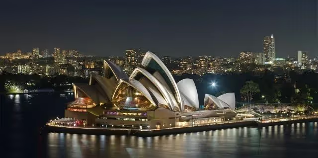
Compare this with Melbourne’s focus on personal culture, where individual human experience is treated just as (if not more) importantly than the whole. Say Melbourne and you think of humans: coffee drinkers, knitted beanie wearers, hipsters (sorry Melbournites, I know hipsters are a sore point). But say Sydney and you think of the harbour, the bridge, the opera house, Bondi Beach, pavements, water, airports, mildly memorable Olympics. Sydney’s reputation is based in iconography, and the humans who happen to live in it are the backstage crew who make it function.
So how do we speak to an audience whose individual faces are lost in the crowd? It’s a delicate balancing act between respecting the importance of being a ‘team player’ in a big city, and maintaining a personal tone. Use narration that celebrates the viewer’s sense of belonging within your target market. Use clear-cut motion graphics that get your message across quickly and with little room for distraction. Speak honestly to your Sydney viewer: more than ever, treat your video like you’re having a no-nonsense heart-to-heart about your brand’s place in their life.
3) sydney is comprised of tribes
While Brisbane has its North vs South face-off, and Melbourne denies traces of its Eastside vs Westside mentality, Sydney is split into a number of regional ‘tribes’ who all come with their own stereotypes and truths: the East, the West, the Inner West, the Shire, and the North (which itself is often split into north shore, northern beaches, and northwest).
These suburb divides align partially with house prices, and also with proximity to places like universities. Like any regional divisions, the intention is not to segregate, but the result is an undeniable cultural quarantine. Working-class West families hang out with working-class West families, while what happens in the Shire stays in the Shire. After all, trekking across the city is an effort. Oh your old work friend wants to meet up for coffee? Great! Oh, it’s on the other side of the bridge? Well, it was nice knowing them.
Speaking to a culturally fragmented audience requires a multi-step process. Firstly, determine which of these tribes your ideal customer is likely to belong to. Research the localities and where they spend their time to determine who you’ll want to aim at and where you’re likely to grab their attention.
Secondly, Sydney’s split cultures make for a diverse city. As usual, select character designs that are going to speak most directly to your target audience, secondarily to your secondary audience, and so on. If your target audiences are wildly different in appearance then consider taking advantage of one of animation’s greatest assets: the ability to make non-human characters relatable and appealing.
Ever wonder why so many animated explainers feature pictograms, jelly bean characters, or sentient blob monsters from who knows where? Because choosing a character with a specific race, gender, age, height, or physical ability to speak for a brand comes with the risk of alienating viewers who don’t fit that profile. At times this risk is mitigated by having a precise profile of your ideal consumer with little need to appeal to anyone else. But at other times a diverse client base (such as a Sydney audience) will benefit from the generalised character design animation can offer.
conclusion
Whether it’s straight-talking rhetoric, remembering the individual amongst the team, or carefully crafted character design, there are plenty of strategies to take advantage of when targeting a Sydney audience. For small and large brands alike, localising your marketing campaigns can mean the difference between a receptive audience and an outraged—or worse, indifferent—audience. Styling your video content to appeal to your audience’s way of life is crucial, whether you’re embarking on a worldwide campaign or focussing purely on the subtle cultural cues found in an individual city like Sydney.
Start a


