The Best Explainer Videos Have These 8 Things In Common

If you want to be successful in anything it’s important – if not vital – to gather the best of the best and find out what shared techniques they all have in common. Sometimes we craft our success by staying within these guidelines and helping them shape our original ideas. Sometimes to be an outlier success is to take these rules and bend them artfully. Whatever your goal is, commonalities are a valuable resource to study, so today we’re taking a look at 8 things great explainers have all got goin’ on.
1) differentiation of brand
What kinds of sights, sounds, and sensations do you get when you think of Coca Cola? Maybe you think of red and white, a metallic ‘tssssss’ sound, and the burning tingle of bubbles down your throat. Maybe you think of rotting teeth and the feeling of a dentist’s needle. Or maybe, like me, you still think of sweet animated polar bears at Christmas time. The way a brand is presented in media affects our mental associations with it almost as much (or sometimes more so) than our real-life experiences with the product. An explainer video is often the first stop for a new startup, and a vital place to craft your first impression with a customer. Even for established companies, an explainer for a new product or change within the brand will be a major connector between you and the consumer. The best explainer videos understand the need to differentiate their brand from the rest of the pack using sight, sound, and scripts that promote the brand’s unique ‘way of life’.
2) personality
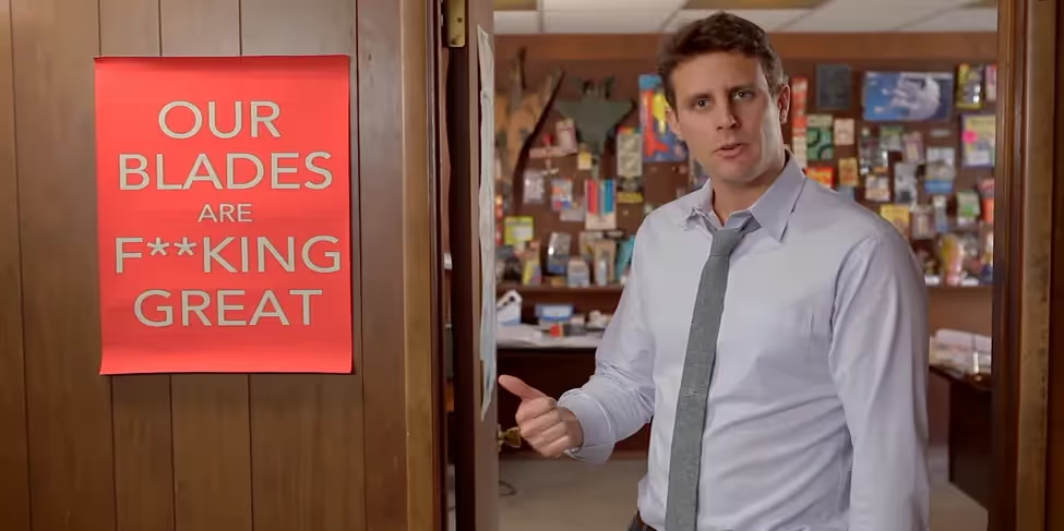
Alongside differentiating your brand from others, the best explainer videos craft a distinct sense of personality within their content – or rather, the personality comes first, and the content exudes from that sense of character. Take for example the goofy-confident personality in the Dollar Shave Club video, which exudes a tongue-in-cheek sense of serious ‘manly’ confidence through its narrator to sell razor subscriptions to the everyman. Or the ‘Back to the Start’ campaign from Mexican food chain Chipotle, which goes so far as using the traditional animation style of stop-motion and a soundtrack from long-established country star Willie Nelson in promoting their sustainable, grass roots image. Think of which video techniques will help push your brand’s main personality trait to front and centre.
3) progression
Every one of the best explainer videos capitalises on progression. We begin at A and take a journey to end up at B. As humans we’re drawn to this narrative over and over because we’re invariably drawn to bettering ourselves – being happier, stronger, wiser. Whatever our metric of success is, we plaster it into a good journey narrative for our own sense of closure and fulfilment.
Progression is revealed in video through story and emotional shift (eg. I had a problem but now I’ve found a solution and will take action to put it into effect), visuals (see Continual Movement below), and impactful music which creates an emotional effect akin to the emotional story arc.
4) brevity
Of every ‘best explainer video’ list you’ll come across on the web, essentially everything is under 5 minutes. Most ad-style videos are under 3 minutes, and many clock in close to the one minute mark. Be brief, be memorable.
5) script clarity
Brevity does not, however, mean cramming an entire essay into two minutes like a poorly organised first-year uni student. Having your voiceover artist speed-read the entire technical workings of your product is worse than frantic and hard to understand – it’s boring. Find your main points: problem – solution – why it’s the best solution – action. Shed the finer details and even the medium details in favour of a compelling concept.
6) visual clarity
It’s more important now than ever before to produce content that can be understood visually without needing sound. Many incidental (and even some purposeful) viewers are viewing video content on small devices with small screens, leaving little room for discerning fine detail. What’s more, these same viewers will often come upon video marketing content on the go – on a noisy commute, waiting in a busy coffee shop, or in a quiet library with their phone on mute, haunted by thoughts of the headphones accidentally left on the kitchen table this morning. Point is, the best explainer videos understand the need for clean, easy-to-understand visuals which ‘read’ well over a variety of devices. If you’re unsure about the clarity of your own content, consider asking a friend who hasn’t seen your video to watch it on their phone or tablet with the sound off and then tell you what they think the video is about.
7) a sense of enlightenment
This is one of the factors that separates explainer videos from the rest of the marketing video pack – explainers are designed, by name and definition, to inform. The best ones leave you feeling a little dazed with a sense of enlightenment, or leave you with a fresh excitement in having learned a new skill, fact, or process to change your life. TEDEd’s animated videos specialise in this area, focussing on explaining an often complex topic in under five minutes with the use of uniquely animated visuals – whether the topic is scientific, historical, sociological, philosophical, or a complex mathematical paradox.
8) continual movement
This is a trend that has been ongoing in explainer videos for some time now – whether it’s the camera, the character, or the background texture, something somewhere must always be in motion. Many newer videos opt for dynamic camera moves from scene to scene, where the camera pans across one giant ‘stage’, weaving shots together with motion rather than relying on traditional ‘cuts’ to each new shot:
Part of this need for continual movement stems from the above need for brevity – your video must be short and therefore must always be in motion to fit everything in. Part of it comes from the notion of modern day attention spans being too short – constant movement is more likely to hold the attention of a distraction-prone viewer. But the third part is what we find in the best explainers, and that is to utilise animation the way it’s supposed to be – in motion. Take advantage of impossible characters in impossible situations framed by impossible camera moves to create the most visually appealing thing you want.
Start a


