We Have No Words For These 6 Scriptless Explainer Videos (Here’s How And Why They Work)

A picture is worth a thousand words, and in this case a video is worth a thousand scripts. While we often think of explainer animations as going hand in hand with a helpful voiceover, some videos do better off letting their visuals speak for themselves. We’ve taken a look at some fantastic examples of explainer animations that work without narration: some from big name brands, others from smaller businesses, but all with unique and effective reasons for why they work so well.
1) google for education: https://vimeo.com/120996252
Why it works: Unmistakable branding
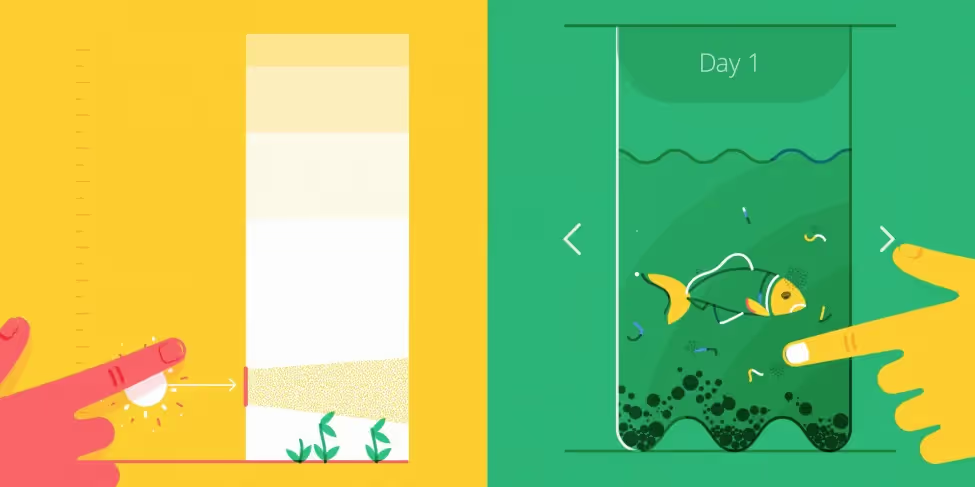
The explainer video for Google’s suite of education productivity tools naturally uses the kind of minimalist motion graphics we’ve come to associate with big name tech brands. This video goes hard on the Bauhaus design, and limits its colour use to the blue, green, yellow, and red palette we know from the Google logo, along with several shades of grey on a pure white background. The visuals lead the charge, while the music and sound effects support rather than lead, offering an inoffensive up tempo jingly corporate track that doesn’t get in the way. This is in fact the crux of the video: mass inoffensive appeal. With a global campaign like Google for Education, the languages, accents and dialects involved in narration act as a barrier rather than a help, and the explainer ends up maintaining wider appeal without it. In terms of branding, this explainer video hits the nail on the head. The whole thing screams Google (without needing to scream anything at all).
2) spotify: https://vimeo.com/207359607
Why it works: It directly demonstrates the value it gives to the customer: music, accessibility, and convenience.
No narration, no sound effects, and minimal text – Spotify’s video campaigns put full focus on a catchy music soundtrack, which only makes sense for one of the biggest music streaming services of the last decade. The animation syncs rhythmically with the music, accentuating the beat with fast, punchy, and colourful cuts from one scene to another. The decreased focus on language means increased accessibility for a worldwide audience, and increased convenience for an audience who wants minimal fuss.
3) scotiabank mobile banking: https://youtu.be/oajpp_3ah8s
Why it works: A simple animated product demonstration shows users how to easily use new mobile banking features
Explainer videos that instruct how to use a product often benefit from being visual heavy (rather than narration heavy), due to the strong power of visual learning. Certain instructionals also need to remain simple enough that they can be used in various settings, such as a kiosk in a noisy shopping centre, or on the viewer’s mobile when out and about. This is no less the case for a multinational bank like Canadian firm Scotiabank, who use a straightforward motion graphics explainer to demonstrate the essentials of their mobile banking services. Features are explained in one short line of text in easy to read language (cheque deposit, for example, is described as “It’s like taking selfies of your money”), along with a quick animated visual that demonstrates the feature (a phone takes a photo of a cheque). There are no bells and whistles on this one: it’s clear, it’s to-the-point, and it isn’t weighed down by a narrator emptily echoing the text.
4) ahrefs: https://vimeo.com/165758164
Why it works: This explainer video for SEO brand Ahrefs is an aural and visual playground.
Visually this video functions like a side scrolling video game: we move to the right for each new ‘scene’, giving us the sense that we’re progressing while maintaining the continuity of being in the same space. Animated lines and shapes pop in and out of background, further supporting the sense of fun and energy.
With no narration, the video offers an absolute feast of sound effects to support the animated movement – from pleasing pops and clicks to soothing bubbles and dopamine-inducing coin jingles. Behind it all is an electronic music track that builds momentum without distracting from the sound effects. It’s a bit like ASMR for easily distracted people, with the visuals, sound, and music all straddling the line between soothing and lively. Two versions of the video exist – one with narration and one without – for viewers who need the extra accessibility.
5) boxcast: https://vimeo.com/257099363
Why it works: Knows where and how it’ll be used to grab customer attention.
While some explainer videos are made without narration for stylistic effect, others are made with a specific purpose in mind. This 3D animated product video for BoxCast, a company specialising in live streaming solutions for organizations, was made for use in a physical retail display. When competing with store music and customer chatter in a shop front, voiceovers go by the wayside and a shopper’s attention needs to be grabbed by dynamic moving visuals. The BoxCast video is designed to be watched from any point and looped, just as an approaching customer would enter the store at any given time.
6) airbnb superhost: https://vimeo.com/345532350
Why it works: Speaks directly to a niche global audience
Airbnb created this social video campaign to celebrate their top hosts as part of Superhost Week. Much in line with the ethos of their home rental services, the video visually promotes the idea of journeys and connectedness with lines and shapes that wrap and twirl and morph into each other, seamlessly taking us from a map to a flower vase to a superhost character to a welcome table within the first ten seconds of video. These themes are more than familiar to the Airbnb hosts who house and trust travellers each day, all over the world. Leaving the video without narration allows text to be more easily translated for international reproduction, and the illustrations to speak directly to the global audience without pesky words getting in the way.
Start a


