Why Do Some People Hate The “Corporate Art Style” (and What Can You Do About It)?

As hard as it is to fathom, there are people out there who aren’t exactly in love with the corporate art style we so often see on explainer videos and business websites. “What?!” I hear you exclaim in horror, “How can anyone not love corporate explainer videos?” We know, we know. It’s a hard truth to swallow.
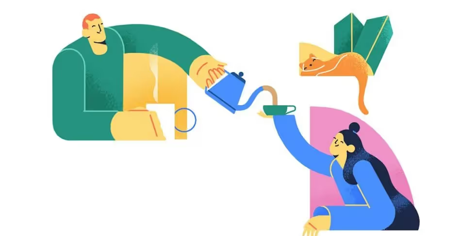
The art that seems to cop the most flack is Alegria – the illustration format designed for Facebook in 2017. This style aims to convey “relatable, everyday stories with simple shapes, flattened perspective, and minimal line work” (https://jsweisart.com/facebook-alegria – worth noting beside the line about ‘relatable, everyday stories’ is an image of a mohawked astronaut playing an electric guitar in space). While most commonly associated with Alegria, other vector styles in the design and animation world have received similar negative judgement and memeification as of late, bracketing them all under umbrella terms like Corporate Art Style, Big Tech Art Style, and Corporate Memphis (https://youtu.be/lFb7BOI_QFc?t=154). Which leads one to ask: why are some people so against the art style we now associate with explainer animation? And what can you do to avoid the same judgement of your own brand materials?
1) unrelatable characters
Animation is wonderful in that you can visualise anyone, everyone, or the totally unreal, with nothing more than a few well-placed lines and shapes. In an attempt to be inclusive across wide audience cultures, many corporate art producers use vivid non-human skin tones and ultra-simplified (or sometimes completely blank) facial features when designing their characters. Unfortunately, this practice has led to one of the art style’s biggest criticisms: the characters are too nebulous to be relatable. To put it another way, when you try to represent everyone, you end up with blue-skinned, dot-eyed characters that represent no one. At its most negative, this kind of character design is sometimes described as a type of token diversity, using the same cookie-cutter characters with stereotypical cultural signifiers laid on top in a lazy attempt to be diverse with homogenous character designs.
2) grotesque proportions
Think oversized limbs, Picasso faces, and ‘wet noodle’ arms. Similar to token diversity, this can sometimes be read as an attempt to de-specify body types so no one feels left out. Unfortunately, this can sometimes head too far into the bizarre, leading to deformed, unearthly characters that leave the viewer feeling confused at best and repulsed at worst. “How do you avoid privileging certain people’s body types over others’ in your illustrations? Give your characters a body type that no one has.” (https://eyeondesign.aiga.org/dont-worry-these-gangley-armed-cartoons-are-here-to-protect-you-from-big-tech/)
3) everyone loves a hype train until they realise it’s a bandwagon
While everything that’s truly popular must have some redeeming features to make it popular in the first place, some people will always come to mock a trend that’s hit the mainstream. A not-insignificant amount of ‘big tech’ companies have adopted the Alegria art style on their website and branding materials in recent years, and when this kind of noticeable saturation occurs, the earlier adopters tend to take a step back and refocus their need to be visionaries somewhere less discovered.
4) some people associate minimalism with childishness
Minimalist artists have long struggled with the armchair criticism of “my kid could draw better than that”. Due to our childhood experiences with simplistic picture books, blocks to learn shapes, and brightly coloured toddler’s cartoons, it’s easy for our brains to default to thinking any simplified use of shape or colour must be for kids or made by kids. This can of course feel insulting to an adult audience, who may feel patronised by the idea that they’re unable to pay attention to audiovisual content that isn’t comprised of bright blocks of colour and exaggerated actions.
5) constant motion
Like an overexcited puppy who has no chill mode, everyone in the world of corporate art and animation is constantly in action. Motion graphics characters can commonly be found dancing, exercising, playing musical instruments, and playing musical instruments in outer space. If you’re in the world of Alegria you better have a hobby and don’t you dare think about stopping for a breather, because apparently the greatest sin a character representing a tech brand can perform is, you know, sitting still in front of a screen.
Even the mildest of actions like smiling, typing, or even blinking are exaggerated into wild gesticulations in the name of creating visual interest. While motion and exaggeration are pillars of creating appeal in animation, issues can arise when unrelenting movement begins to create visual fatigue.
6) “obnoxiously joyful”
Worse still, the ceaseless joy of these over-active characters can come off to some as obnoxious or, to a more extreme degree, oppressive. Imagine a world where every human is a clean-edged copy and pasted character, forced to smile 24/7, with jobs and hobbies that seemingly never end. It’s easy to see how some can feel an Orwellian or Stepford Wives vibe radiating from the innocuous animated characters in this brightly coloured, corporate branded world.
so… what can you do about it?
So you’ve come to terms with the fact that not everyone in the current culture will like the corporate art style – what now? Is the only way forward to avoid vector characters forever? The truth goes a little deeper than that, and it speaks to the real reasons some are revolting against the corporate design aesthetic.
The biggest thread linking together the above points is that the corporate art style amplifies insincerity in a brand. Characters so afraid of customer alienation that they resemble no one; colour and movement choices that avoid real emotions by promoting an unrealistically bright and positive world – while these design choices aren’t inherently bad on their own, they are more defined by what they aren’t than by what they are. They stand for everything and, therefore, end up not saying anything.
The best way to escape the association with the negative side of the art style is to be secure in your brand’s purpose, personality, and honesty. Being clear on who you are and who your community is, helps sidestep the ‘cookie-cutter’ trap that a lot of big tech art falls into, and instead allows for a focussed design goal, to craft something that actually reflects the uniqueness of your brand and your audience.
Start a


