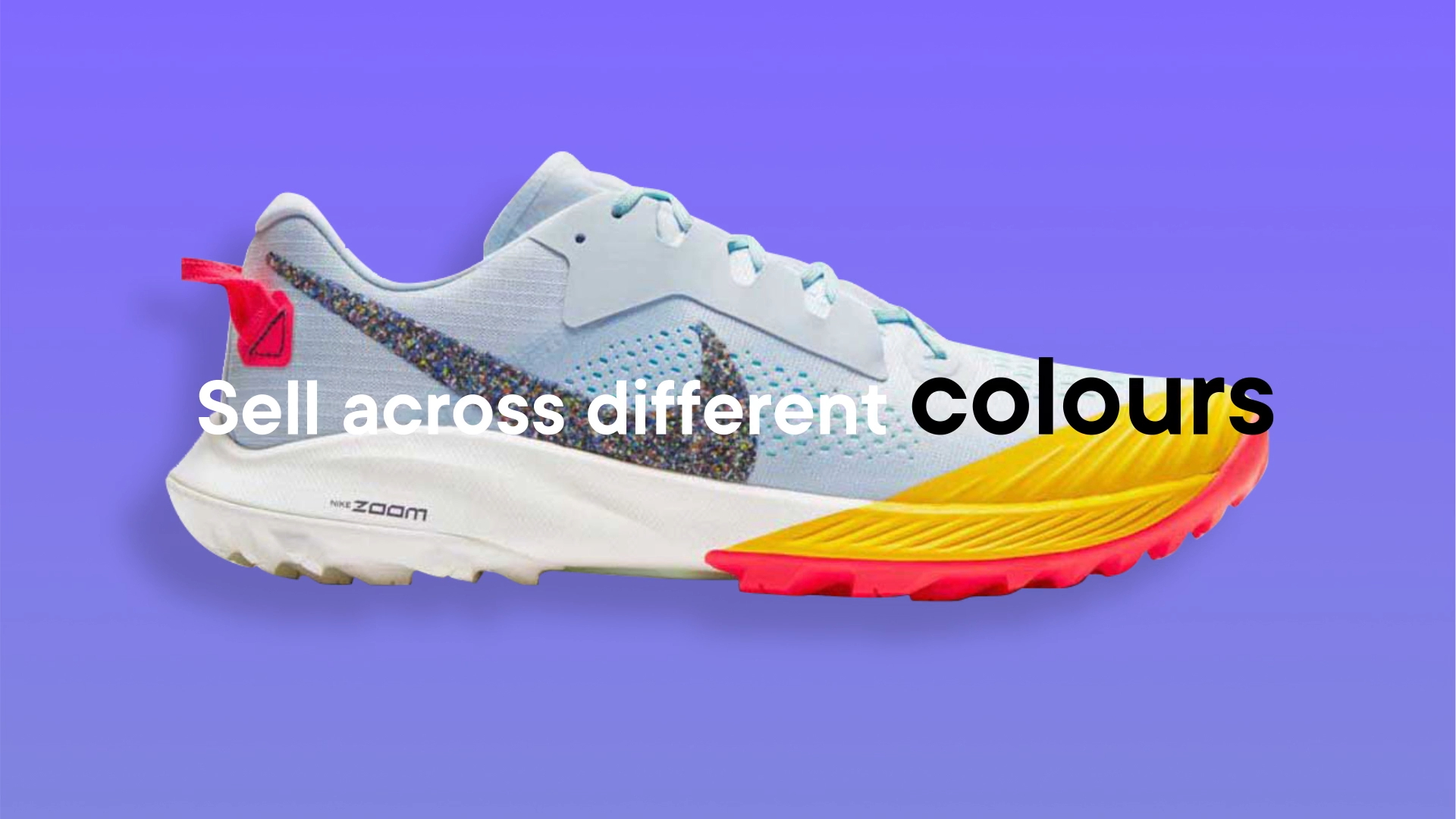
Online shopping is supposed to be easy.
And yet somehow, finding the best deal can still feel like wandering through 47 tabs, three abandoned carts and a quiet existential crisis about whether you really need another pair of shoes.
Better That wanted to cut through all of that. Their platform helps shoppers compare products and find better deals online, so they came to us needing a punchy animated ad that felt fast, exciting and a little addictive.
Basically, all the things online shopping should be.
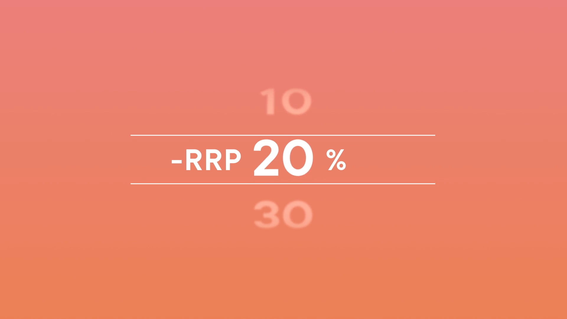

The challenge was speed.
This was not a gentle “sit back and let us explain” kind of spot. It needed to grab attention quickly and hold it, especially for audiences who could swipe away the second their thumb got bored.
So the strategy was to strip the message right back. What did people absolutely need to know? What could disappear into the bargain bin? The script was pared down to its essentials, making room for rhythm, attitude and visual punch.
No waffle. No feature list. No polite little explainer wearing sensible shoes.
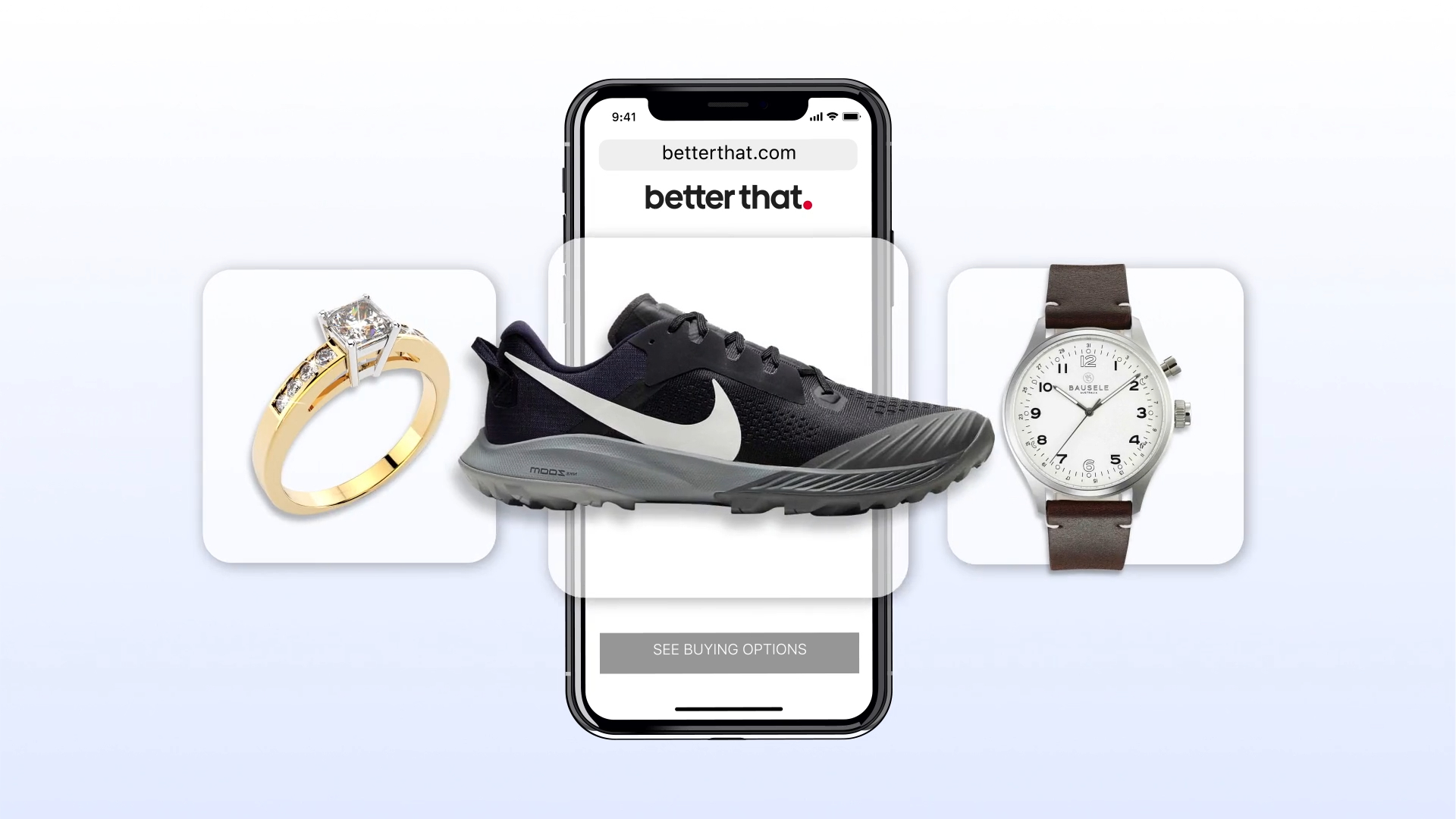
The first direction followed the brief closely.
We chose images, built the structure and delivered something that matched what had been asked for.
And then came the classic creative plot twist: they hated it.
Not because it was wrong. Because sometimes what you ask for and what you actually want are two different beasts wearing the same jacket.
So we went back in. We explored, sketched, tested, turned the music up and looked for a direction that felt more alive.
That is when the final style clicked: fast, bold, fashion-forward and built to move.
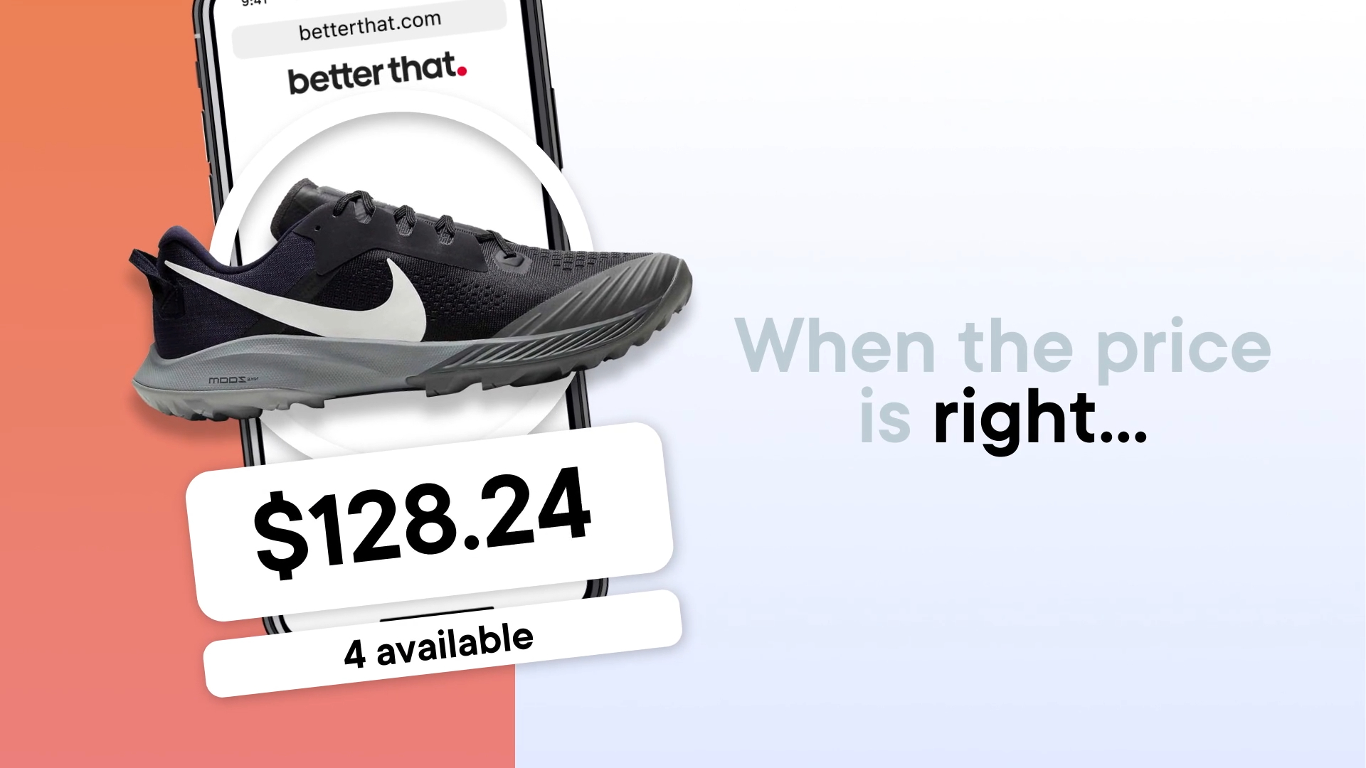
The finished look had to feel like online shopping at full speed.
Sharp cuts, punchy imagery, quick transitions and a strong sense of rhythm gave the spot its energy. The visuals needed to feel stylish without becoming precious, polished without becoming slow, and exciting without making everyone motion sick.
A delicate balance, really. Like wearing new shoes before breaking them in, but for animation.
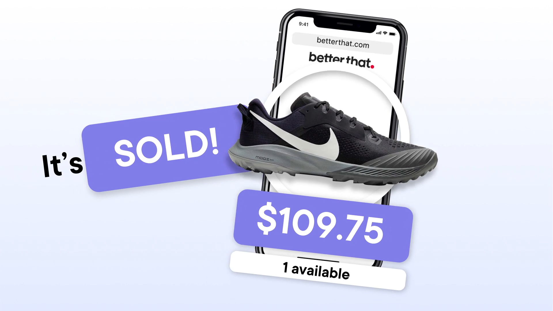
Refinement was all about finding the sweet spot between speed and clarity.
We pushed the pacing close to the edge, then pulled it back just enough so the message could still land. Every shot had to earn its place. Every moment had to keep the viewer leaning in.
The final result was sharper, more confident and much closer to the feeling Better That wanted from the beginning.
Even if we had to take the scenic route through “nope, not that” to get there.

The final animation gave Better That a fast, energetic ad that matched the promise of the platform: less endless searching, more finding the good stuff.
It was punchy, stylish and built to stop the scroll, which is exactly what you want from an ad about making online shopping feel easier.
Because nothing says “better deal” like not having to open 18 tabs.