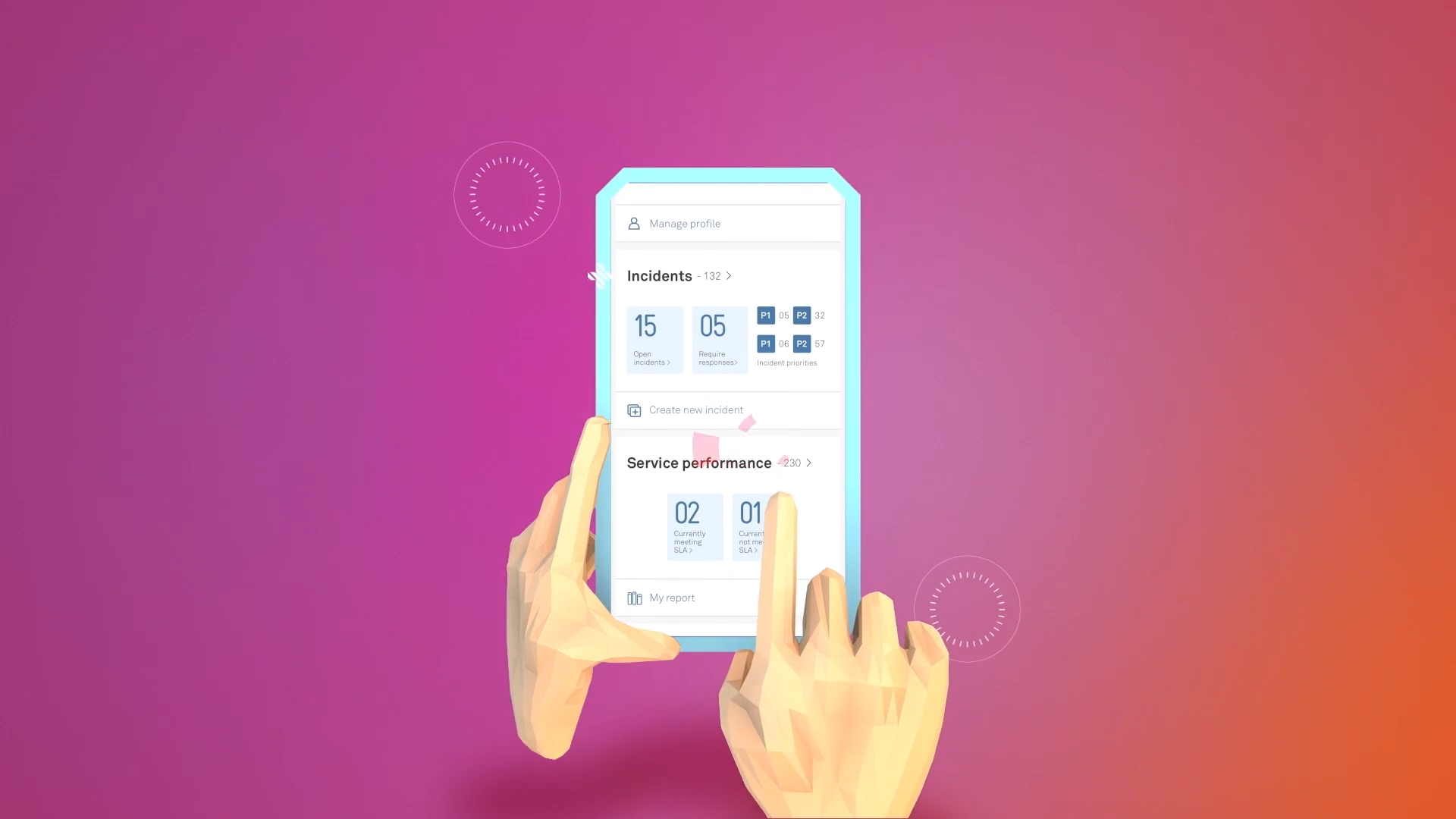
Telstra were unveiling a new program designed to manage customer interactions and help teams see, in real time, how their system was performing.
Which is very useful, because “we think something might be happening somewhere in the system” is not exactly the sentence dreams are made of.
They came to Explanimate needing a video that could introduce the program clearly, show why it mattered and help people understand how better visibility could support better customer experiences.
The challenge was taking something technical and operational, then turning it into a story people could actually follow without needing three monitors and a very strong coffee.


The strategy was to focus on the value of visibility.
The program was not just about data for data’s sake. It was about giving teams a clearer view of customer interactions, performance and issues as they happened, so they could understand what was working, what needed attention and where action was needed.
That meant the video needed to explain both the system and the human benefit behind it.
Because real-time performance monitoring sounds impressive, but “helping teams respond faster and support customers better” is the bit people actually care about.

The creative idea centred on clarity in motion.
We wanted to show information moving through the system, customer interactions being tracked, and issues becoming visible before they turned into bigger problems. The animation gave shape to something that would otherwise live inside dashboards, workflows and back-end processes.
Less “here is a complicated platform.” More “here is what this helps people see.”
That approach helped make the program feel practical, purposeful and easier to understand.
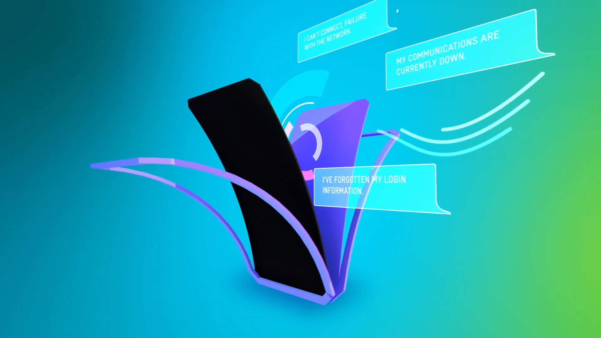
The visual style needed to feel modern, polished and unmistakably connected to a large-scale technology environment.
We used clean design, clear movement and system-inspired visuals to show how information could be captured, monitored and acted on in real time. The aim was to make the complexity feel organised rather than overwhelming.
No chaotic dashboard spaghetti. No tiny unreadable charts having a panic attack.
Just a clear visual world that helped the audience understand what the program did and why it was useful.
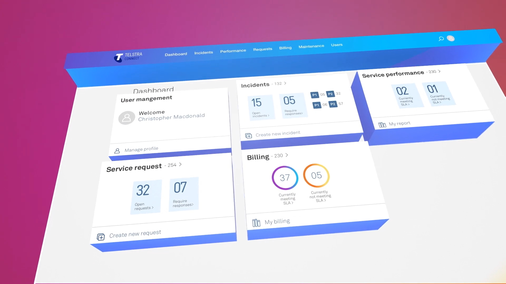
Refinement focused on making the story feel simple without making the system feel small.
We adjusted the flow, pacing and visual hierarchy so the audience could follow the journey from customer interaction, to system insight, to team action. Each section needed to build logically, with enough detail to feel credible and enough restraint to avoid turning the video into a software manual with better lighting.
The final piece found the sweet spot between technical explanation and clean communication.
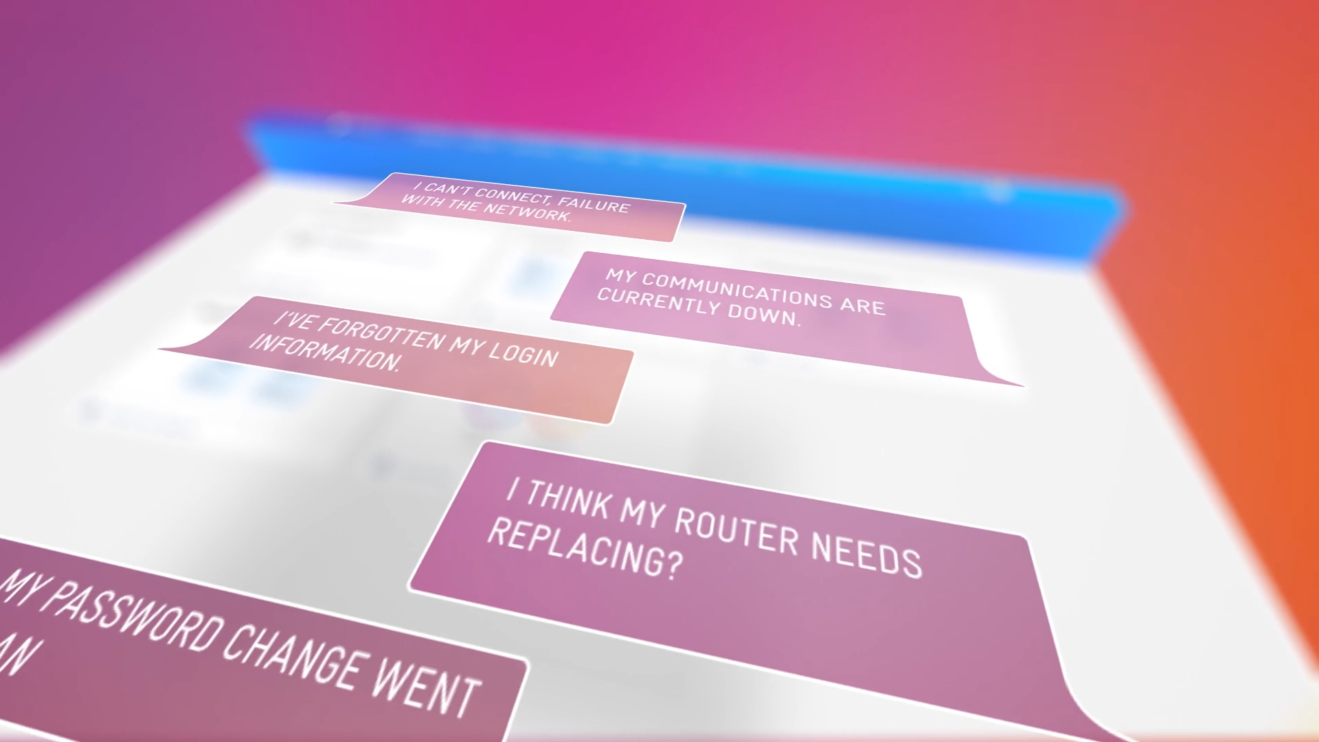
The video was so successful for Telstra that they commissioned a series of videos.
Always a nice outcome. Very “we liked that, please keep going.”
The final piece helped introduce the new program in a way that made real-time performance, system issues and customer interaction management feel clear, useful and worth paying attention to.
Because when a system helps people see what is happening sooner, the video explaining it should probably be just as clear.